The dashboard of Power BI is often called canvas and is a single page that takes the help of visualization to tell a story. Since the space on a page is limited, the dashboard provides only the major important parts of a story. The readers can see the related reports if they want to know more details about the subject.
The dashboards are the features that are available to the Power BI only. However, you cannot build a dashboard on a mobile device, but you can share them and view them.
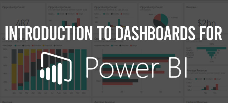
Dashboard
The visualizations which you are able to see are known as tiles. You have to “pin” the tiles to a dashboard from a report.
The reports are based upon a database, and the reports are the thing from where the visualization on a dashboard originated. The dashboard is one of the gateways to the database and the reports which lay underneath. When you will select the visualization, you will be directed to the reports the visualization is actually based upon.
The Advantages of The Microsoft Dashboard
One of the best ways to monitor your business and to keep up-to-date with all of your major information is by using the dashboard. The dashboard can get its visualization form multiple underlying reports or one report; or multiple underlying databases or one database.
The dashboard performs the combination on-location and then cloud data, giving a compact look no matter where the actual data is. It is not only some beautiful picture, but it s also interactive and as the data underneath changes, the dashboard gets updated.
Power Bi Dashboard Design
After building a dashboard and implementing the tiles, now you have to make your dashboard beautiful as well as functional. In one word you have to make your dashboard stand out among all the other dashboard.
Keep Your Audience in Mind
You always have to keep in mind that the dashboard is an overview, a place where you can monitor the present state of your data. Since the dashboard is built on the basis of the underlying databases and reports, it contains a huge amount of details. Hence you dont have to put the details on the dashboard unless you want the reader to monitor that information.
The place where your dashboard is viewed is very important. If it is viewed on a large screen, then you can put a lot of information on it. However, if the audience view it on mobile phones or tablets, then you have to put lesser tile so that it is more readable.
Telling a Story
Since the dashboard is required to show crucial information at a glance, it is best to put all the tiles on one screen.
Utilize the Full-Screen Mode
Your dashboard should always utilize the full screen when you are displaying a dashboard.
The important information Should Always be Put Into Accent
If you apply the same size for the visualization and text on your dashboard, then the readers will not be able to focus on the important part of the dashboard. For example- to represent an important number and to make it stand out, using the card visualization can be a good option.
Placement of The Important Information
People usually go through the dashboard from top to bottom. Hence, you should always put the most important article at the top mad the less important articles at the bottom.
Apply the Correct Visualization to Represent the Data
You should always use visualization for the data representation. However, you should not use too much variation. The main motive more the visualization is to evoke an image in the reader’s head and at the same time, it should also be easy to read.
Some data requires a simple visualization while others require a more-complex design. It is up to you to decide which is appropriate for the data. Be it a simple visualization or a complex one, it should not be confusing to the readers.
- Some visuals may look beautiful but at the same time can be hard for the readers to read. 3-D chard is one such example.
- Using donut charts, gauges, pie charts and other types of circular charts are not good visualizations. The pie chart is only good to use if the categories are less than eight in number. It is difficult for people to compare values on a pie chart rather than in a column chart.
Gauge charts are appropriate to show the current status by shaping it in the form of a goal.
- In the case of the dimension values in the charts, you should be persistent in using the colors, chart dimension ordering, and chart scales.
- You should be careful in doing the encoding of the quantitative data. While displaying the numbers, you should be careful to not apply more than 3 or 4 numerals. When you showing the measures on the screen, you should use 1 or 2 numerals located on the left side of decimal point for example- 4.5 million and not 4,500,000.
- Always be careful not to mix the different scales of measurement on a bar or line chart. Like, if one measurement is in thousands and the other one in millions, then it will be very difficult to know the difference. In these cases, you should consider using another axis to represent them separately.
- Avoid making your chart congested with unnecessary data labels. The bar is used to make the people understand the number without displaying the number itself.
Conclusion
So, the Microsoft dashboard is a place to display data in a precise manner. The power bi dashboard design is also important so that people can quickly locate the most important part of the dashboard.
The design is also a key part of making the dashboard less cluttered, readable, and attractive. With the proper design, you can create a great dashboard.